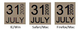
Once again, after reading somebody else's article, I felt inspired to put together an alternative example. In this case: Text Rotation.
Within the article I linked to, the example uses an image sprite and a sprinkle of CSS to get things positioned right. Well, maybe not so much a sprinkle. It's like the top fell off the pepper shaker and you've suddenly got a large pile of pepper on your food. It makes me want to sneeze.
Thankfully, many of the popular browsers of today support the ability to rotate HTML elements. Even better? We can make it work in Internet Explorer (back to version 5.5 even). How you might ask? Okay, let's look at the HTML.
Code
<div class="example-date"><span class="day">31</span>
<span class="month">July</span>
<span class="year">2009</span>
</div>
Nice and clean without too many extras. I conscientiously chose the date order I did to avoid having to use a comma. Otherwise, an extra span would be required to remove the comma from our final design.
The Magical CSS
For Webkit and Firefox (as of 3.5), you can take advantage of the proposedtransform property to handle the rotation. Each browser requires its property prefix for now.-webkit-transform: rotate(-90deg);
-moz-transform: rotate(-90deg);
In order to perform a transformation, the element has to be set to
display:block. In this case, just add the declaration to the span that you want to rotate.When it comes to effects in Internet Explorer, there is a surprising amount of power (and untapped at that, I'd say) in using filters. Although misleading, there is a filter called BasicImage that offers up the ability to rotate any element that has layout.
filter: progid:DXImageTransform.Microsoft.BasicImage(rotation=3);
The rotation property of the BasicImage filter can accept one of four values: 0, 1, 2, or 3 which will rotate the element 0, 90, 180 or 270 degress respectively.
The BasicImage filter has other properties that can be set such as mirroring, masking, greyscale and others. Alternatively, you can take advantage of the Matrix filter but the coordinates still don't make any sense to me.
In action
31 July 2009

Here's hoping the article has offered up a little inspiration and shown that even IE has a few tricks up its sleeve, allowing us to pull off some layout fun.


0 komentar:
Posting Komentar