


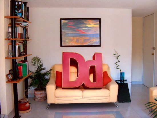
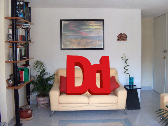
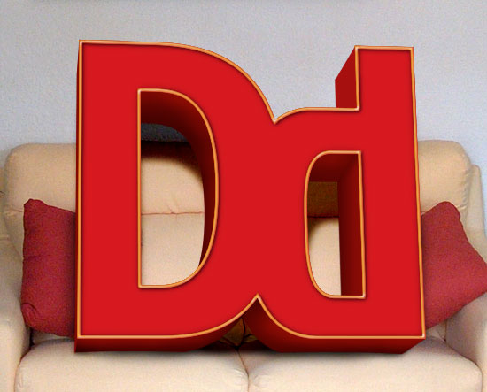
Below, you’ll see the preview of the photo manipulation scene that we’ll be creating together – you can click on it to see the full-scale version.
Let’s get this thing rolling, shall we?
Opening the stock photo in Illustrator
1 We are going to use a free stock photo of a living room called Home Interiors 1 by Jeinny Solis. Download this image.
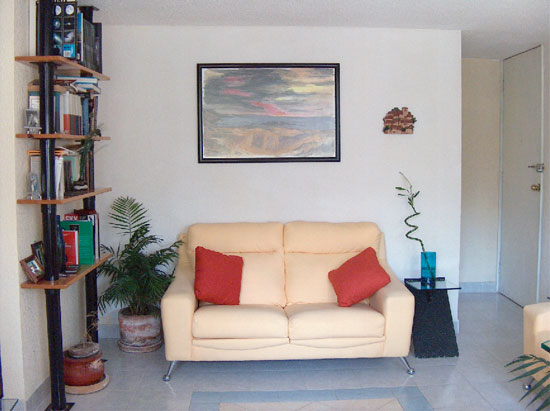
2 Open the Home Interiors 1 photo in Illustrator by choosing File > Open… (Ctrl + O).
Placing the text onto the canvas
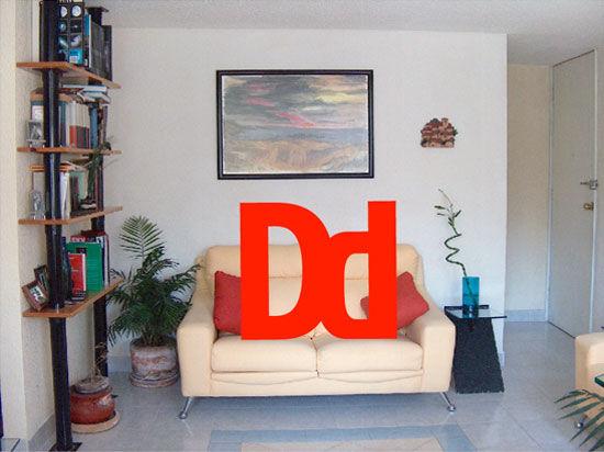
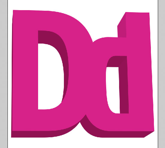
3 Use the Type Tool (T) to add the text "Dd" onto the canvas.
4 Resize the text by activating the Selection Tool (V), holding down the Shift key to keep the text proportional, and then dragging the transform controls appropriately so that the size is roughly the same size as the following figure.
5 Change the fill of the text using the Fill Tool (X): the color used in this tutorial is a red color (#CC3333) but you can use any color (though keep in mind that it is easier to work with a mid-toned color).
Giving the text a 3D look with the Extrude & Bevel effect
6 We are going to give the text a 3-dimensional look – choose Effect > 3D > Extrude & Bevel to open up the 3D Extrude & Bevel Options dialog box. Make sure that the Preview option is checked so that you can see a live preview of the changes we’re about to make.

7 Change the position settings in the 3D Extrude & Bevel Options dialog box; this will change the angle of the text. Use the values 13, -7, and -1 which corresponds to the X-axis, Y-axis, and Z-axis angles.
8 Next, we are going to change the “Extrude Depth” which controls the depth of the objects extrusion. Keep in mind that if the value is too small, the extrusion will be hard to see, but if the value is too big, it will throw off the proportion of the object. The value used in this tutorial is 231 pt.
9 Finally, we are going to change the object’s perspective angle. This one is tricky because it all varies depending on the length of your text. If you were using text that is wider than what we’re using now ("Dd"), you will want to shrink that down or else it will start to curve too much. This tutorial uses 23 as the Perspective value.
Expanding and ungrouping the 3D text object
10 Now that we have created our 3D text object, it’s time to break apart each section so that we can bring it into Photoshop (This will make it easier to work with over there). To start, click on your 3D text object and choose Object > Expand Appearance to create lines and points around it and to break it up into sections.
11 Ungroup the 3D text object so we can bring it into Photoshop piece by piece, do this by choosing Object > Ungroup (Ctrl + Shift + G). You may have to use the Ungroup option a few times to completely ungroup the object.
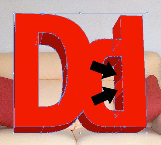
Combining similar parts of the 3D object using Pathfinder
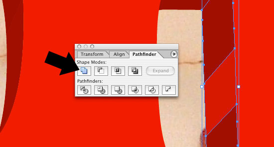
12 First, make sure that the Pathfinder window is visible: choose Window > Pathfinder (or Press Shift + Ctrl + F9 to toggle the window).
13 Before we start bringing the parts into Photoshop, we need to make sure that each side of our logo is one object. For example, the right inside of the lowercase "d" is separated into multiple parts; to combine similar parts into one object, hold down the Shift key and click on each individual part.
14 With the similar parts all selected, click on the "add to shape area" option in the Pathfinder window to combine them into one object. Do this for any other parts of the 3D object that are similar to each other.
Transferring the 3D text object into Photoshop
15 Now, we can start piecing our 3D text object together in Photoshop. First, create a new Photoshop document that is 3000px by 3000px in dimension (it’s easier to scale down the image or canvas size rather than scaling it up – so we’ll work with ample room).
16 Use the Selection Tool (V) and dragging around the 3D text object in Illustrator to select all of the pieces.
17 With all the parts of the 3D text object selected, choose Edit > Copy (Ctrl + C) to place it into your clipboard.
18 Head on over to Photoshop and then choose Edit > Paste (Ctrl + V) to paste the 3D text object onto your Photoshop canvas. This will sort of serve as a guide while we copy and paste each of the pieces of the 3D text object from Illustrator to Photoshop.
Adjusting the guide layer’s hue
19 We are going to change the hue of the 3D text object in Photoshop so that we can easily see the difference between the pieces we are going to bring in from Illustrator. To change the Hue, choose Image > Adjustments > Hue/Saturation… (Ctrl + U) to open up the Hue/Saturation dialog box. The color you choose for the hue adjustment doesn’t matter because we’re only doing this to help us see the parts easier, but in case you’re curious, I’m using a magenta color (#901252).
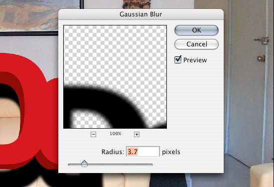
Bringing the Illustrator parts into Photoshop
20 To keep things organized, create a new group in the Layers Panel by clicking on the icon the looks like a folder.
21 In the new group you created, start copying (Ctrl + C) each section from Illustrator and then pasting (Ctrl + V) them into the Photoshop document until you have pieced everything back together. It may help to drop the opacity down to 50% on the pieces’ layers so that the guide we created in Step 18 shows through; this makes it easier to line up the pieces.

Setting up the composition in Photoshop
22 Let’s open up the stock photo (Home Interiors 1) in Photoshop by pasting the image in its own layer from Illustrator (or if you prefer, you can use Photoshop’s File > Place… option); the stock photo should be the lowest layer in the Photoshop document.
23 On the Layers Panel, first making sure that you’re on the new group that contains the sections of the 3D text object you copy and pasted from Illustrator to Photoshop, use the Move Tool (V) to move the entire group on the couch, for finer and more accurate movements, use the arrow keys.
Adding a drop shadow on the 3D text object
24 We are now going to start adding a shadow on the back of the couch and the wall coming from the lettering. We want to figure out where the sun is and which way the shadows are casting. In this photo, the light source come from behind the viewer, so the majority of the shadows are going to be straight behind the 3D text object. To make the shadow, we are going to start by duplicating the layer (Ctrl + J) with the 3D text object face.
25 Next, create a selection around the duplicated 3D text object face layer by Ctrl + clicking on that layer’s thumbnail in the Layer Panel.
26 With the selection created, use Edit > Fill… (Shift + F5) to fill in the selection. Use a fill color of black (#000000).
27 Move the duplicated layer down the Layers Panel, below our 3D text object. This duplicated layer will serve as the drop shadow layer.
28 To get a realistic shadow look, we are going to blur the drop shadow layer we created in the previous section. To do so, go to Filter > Blur > Gaussian Blur and use the settings in the following figure.
29 Lower the opacity of the drop shadow layer to 25% and change the layer’s Blend Mode to Linear Burn. Now, we want to duplicate this layer by right-clicking on the layer in the Layers Panel and choosing Duplicate Layer… (Ctrl + J).
30 Change the Blend Mode of the duplicated layer to Overlay; this will give us a shadow that doesn’t look flat and unrealistic.
31 To keep our work organized, create a new group (using the folder icon on the Layers Panel) called "Logo Shadow" and move the two drop shadow layers we just created inside that folder.
Masking areas that shouldn’t have the drop shadow
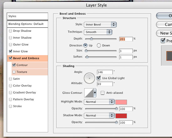
32 Add a layer mask by clicking on the second icon from the left in the Layers Panel inside the "Logo Shadow" group.
33 Set your foreground color to black (#000000) and use the Brush Tool (B) with a Hard Round brush tip to paint areas on the layer mask that don’t need the shadow. For example, the bottom shadow that hangs over the bottom part of the 3D text object can be masked. For the brush tip settings, you can set the Master Diameter to 60px, the Hardness to 50% and Opacity to 100%.
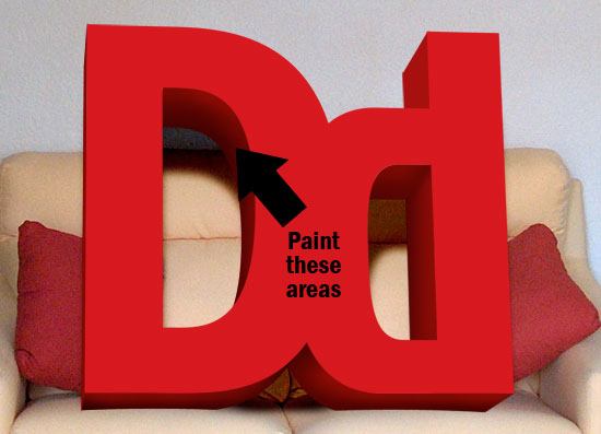
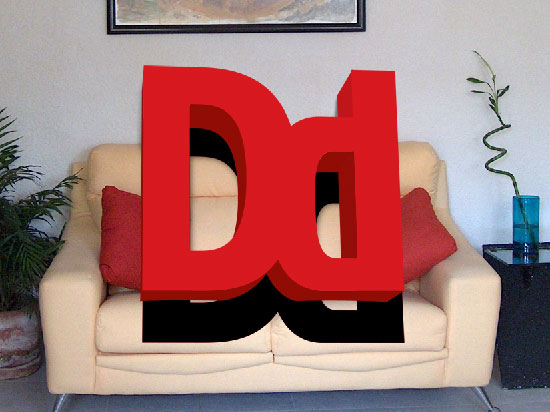
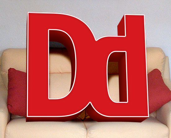
You should end up with something like the following figure.
Creating more drop shadows
34 Now, we are going to duplicate each of our edges of the 3D text object so we can create some more shadows. To do this, activate the Move Tool (V), click one of your edges in the canvas, and duplicate the selection into another layer by pressing Ctrl + J.
35 Create a new group called "Shadows" and start dragging all the duplicated layers of your edges in there.
Adjusting the color of the Shadows layers
36 We’ll use the Curves option to adjust the color of the Shadows layers; to do so, open up the Curves dialog box by choosing Adjustments > Curves… (Ctrl + M). Drag one of the sliders to the left or right until it darkens our 3D text object’s sides. Repeat this step from every edge of the 3D text object except for the top part of the letter "d" to make the lighting dynamics realistic.
Adding the layer styles to the front face
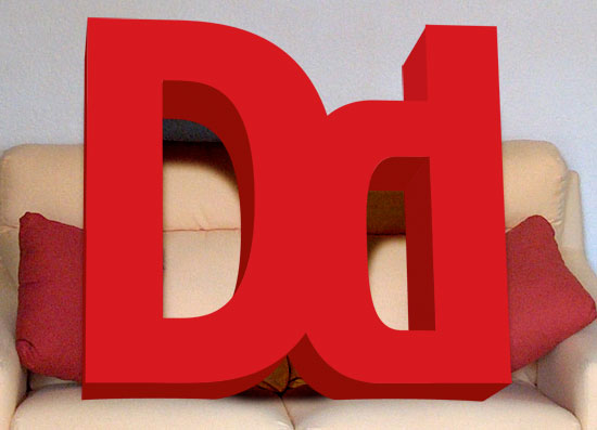
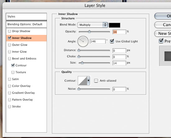
37 We are going to add some layer styles to the front face of our 3D text object. First, make sure the layer containing the front face of our 3D text object is active in the Layers Panel. Then, click on the Add a Layer Style… icon on the bottom of the Layer Panel (the icon that looks like the letters "fx") and then select Inner Shadow. This is going to give us some contrast and give the 3D text object’s face a more realistic look.
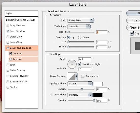
38 Click on the Add a Layer Style… icon again, but this time select Bevel and Emboss. This is going to give us a shine effect on the edges of the logo, which gives the impression that the light is reflecting off of it.
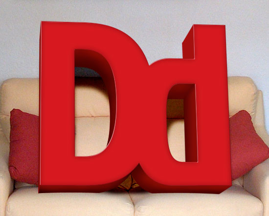
Your outcome should look something like the following figure.
Adding an edge to the 3D text object
39 Let’s add an edge to the 3D text object, kind of like a brass band around it. First, duplicate the 3D text object face layer (Ctrl + J), then create a selection around the 3D text object face by Ctrl + clicking on the layer’s thumbnail in the Layers Panel.
40 With the selection around the 3D text object created, choose Select > Modify > Contract, and enter 3px in the Contract By field to reduce the size of the selection.
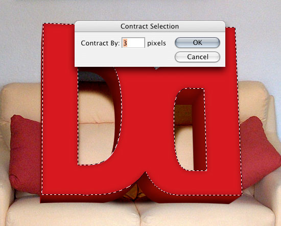
41 Delete the area under the contracted selection by choosing Edit > Clear or pressing the Del key.
42 Remove the layer styles on this layer; to do this, in the Layers Panel, drag the layer styles from the layer to the trash can icon on the far right bottom of the panel.
43 Now, create another selection in the layer by Ctrl + clicking on the layer and then fill the selection with a white color (#FFFFFF) by choosing Edit > Fill… (Shift + F5). This filled in part effectively creates a white border around our 3D text object’s face.
Adding layer styles to the edge of the 3D text object
44 Add some layer styles to the white border we just created by clicking on the Add a Layer Style… icon in the Layers Panel and choosing Inner Glow. Change the color of the Inner Glow layer style to #CC6600 and adjust the settings to match the following figure.

45 Add another layer style to the layer, this time choose Bevel and Emboss. Change the settings to match the following figure to give the border a three-dimensional look. Change the color of the highlight to #FF9999 and the shadow to #CC3333.
46 Add a Contour layer style by checking the box below the Bevel and Emboss layer style: change the Range value to 100%.
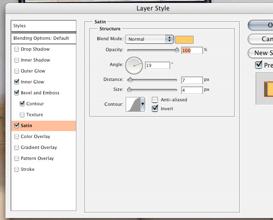
47 Finally, add a Satin layer style: change the color setting to #FFCC66.
Adding a subtle shadow on the 3d text object edge
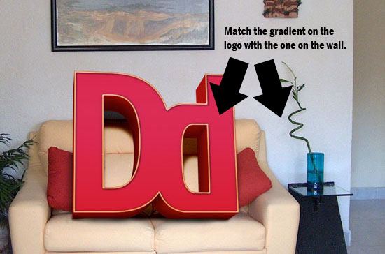
48 To make the design more impressive, we’ll add a slight drop shadow on the 3D text object’s edge. Start by duplicating the edge layer (Ctrl + J), creating a selection around it by Ctrl + clicking on the duplicated layer’s thumbnail, and filling the selection with a black color (#000000) using Edit > Fill… (Shift + F5).
49 Remove the layer styles on this layer (which was also duplicated from the previous layer) by dragging them onto the trash can icon.
50 Bring the duplicated layer below the original layer.
51 Use the Move Tool (V) and your arrow keys to move the edge shadow slightly to the down and to the right.
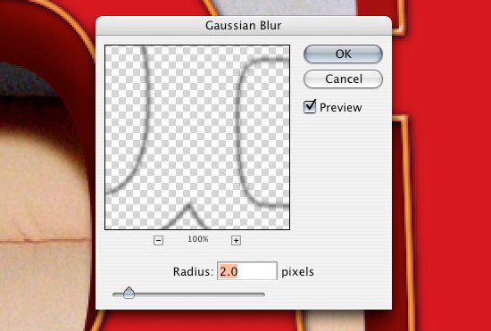
52 Blur the shadow by choosing Filter > Blur > Gaussian Blur and changing the Radius value to 2.0 Pixels.
53 Create a selection on the logo face layer by Ctrl + clicking on the layer’s thumbnail in the Layers Panel, and then invert the selection by choosing Select > Inverse (Ctrl + Shift + I).
54 Delete the area inside the inverted selection (Edit > Clear or press the Del key) – this will get rid of the shadow that isn’t within the 3D text object’s face.
55 Change this layer’s Blend Mode to Linear Burn, and reduce the Opacity value to 40%.
Making the superimposing more realistic
56 Now, let’s make the photo manipulation a bit more accurate. Since the 3D text object is sitting on the couch, it is probably sinking into the cushions a little bit because of its weight. To do this, we start by adding a layer mask (click on the Add layer mask icon in the Layers Panel) icon from the right on the layers palette) to both the shadows layer group and the logo edges group.
57 Using the Elliptical Marquee Tool, create a selection that looks roughly the same as the following figure.
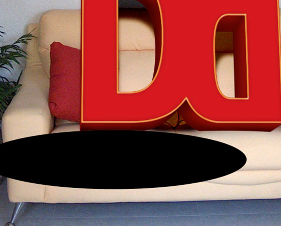
58 Fill both layer masks with a black color (#000000) by choosing Edit > Fill… (Shift + F5).
59 Do Steps 56 – 58 for the lower portion of each of letter – this will give us an edge that makes the 3D text object look like it’s sinking into the couch a little bit.
Creating shadows on the couch
60 To make our composition even more realistic, we’re going to add a shadow on the couch. First, create a layer called "Couch Shadow".
61 Activate the Brush Tool (B), and use a brush tip with the Opacity set at 10%. Start painting in some shadow areas, focusing on the bottom of the logo on the couch, and a little shadow on each of the pillows.
62 After you have created the shadows, duplicate the "Couch Shadow" layer (Ctrl + J) and change the Blend Mode of the new layer to Overlay.
Blending the 3D object text into its background
63 We want to adjust the color of the duplicated layer so that we can blend the 3D text object with its background. To achieve this, we’ll add a light blue reflection going across the canvas. First, set your foreground color to a light blue color (#9ABAFB) and then create a new layer.
64 Now, choose the Gradient Tool (G) in the Tools Palette, and set the gradient type to Reflected Gradient. Create the gradient on the new layer by clicking and dragging your mouse so that it follows the reflection on the wall.
65 Create a layer mask (by clicking on the Add layer mask icon in the Layers Panel) and then create an inverse selection on the 3D text object’s face by first Ctrl + clicking on its layer group in the Layers Panel, and then inverting the selection using Select > Inverse (Ctrl + Shift + I).
66 Fill the inverted selection with a black color (#000000).
67 Change the layer’s blend mode to Soft Light.
Adjusting the color of the 3D text object
68 Let’s change the Hue/Saturation of the text by adding an adjustment layer. Click on the Create fill or add adjustment layer icon on the bottom of the Layers Panel and then choose Hue/Saturation.
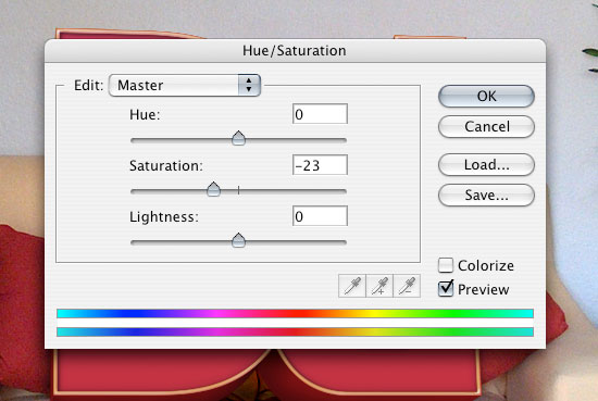
69 You’ll notice that the adjustment layer changes the entire image. To fix this we are going to add a layer mask (click on the Add layer mask icon on the bottom of the Layers Panel) to the Hue/Saturation layer.
70 Create a selection around the 3D text object’s face by Ctrl + clicking on the layer group in the Layers Panel. Invert the selection, Select > Inverse (Ctrl + Shift + I).
71 Making sure you’re on the layer mask – fill the selected area with a black color (#000000).
72 We’ll adjust the Curves again, Image > Adjustments > Curves (Ctrl + M); use similar settings as the figure below.

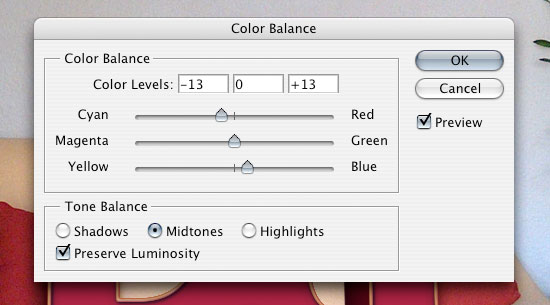
73 We’re going to adjust the Color Balance settings, Image > Adjustments > Color Balance… (Ctrl + B); use similar settings as the figures below.

Congratulations, you’re done!
That’s it, play around some more, maybe experiment with color adjustments, add textures to the 3D text object, and adjust the positioning/angling of the 3D text object until you get something that you like.
This is what I ended up with:
Share your results
If you followed along the tutorial, feel free to share your results in the comments by providing a link – we’d love to see what you’ve got!
Download the source file
You can download the source file for this Photoshop tutorial as a ZIP file.
3d-text-photo-manipulation.zip (ZIP, 24.8 MB


1 komentar:
perfekta!!!! nice work
Posting Komentar